


PORTFOLIO
BEAUTY
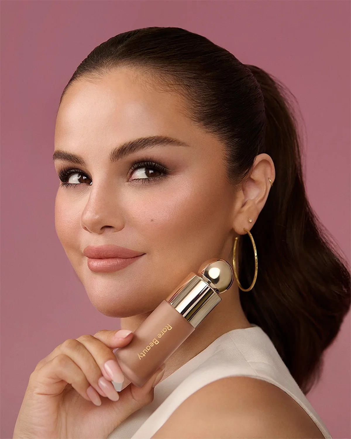
Rare Beauty
Emails, product descriptions
Created by Selena Gomez, Rare Beauty is on a mission to change the face of the beauty industry by championing self-expression, authenticity, and confidence. The makeup brand is all about celebrating—not covering up—what makes every person unique. Copy was designed to resonate with Selena’s deeply loyal fan base while letting the brand’s personality shine through. The voice needed to feel sincere, inviting, and unmistakably Selena… more like a conversation with a friend rather than just another beauty brand talking at you.
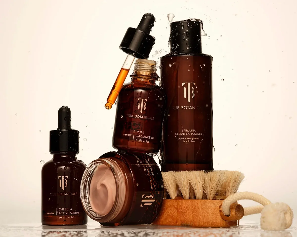
True Botanials
Emails, product descriptions
True Botanicals is a pioneering skincare brand known for pairing non-toxic ingredients with clinically proven results (it’s also the world’s first MADE SAFE® certified skincare line). In the uber-crowded “clean-beauty” landscape, the brand needed to stand apart from the Sephora hype and make its case as a true leader in the category. Copy needed to strike the right balance between science and self-care: clinically credible, beautifully elevated, and approachable. Founded in 2020, Rare Beauty has grown into a multibillion-dollar cosmetics powerhouse with annual revenues exceeding $400 million
SkinSkulpt
Brand identity, packaging
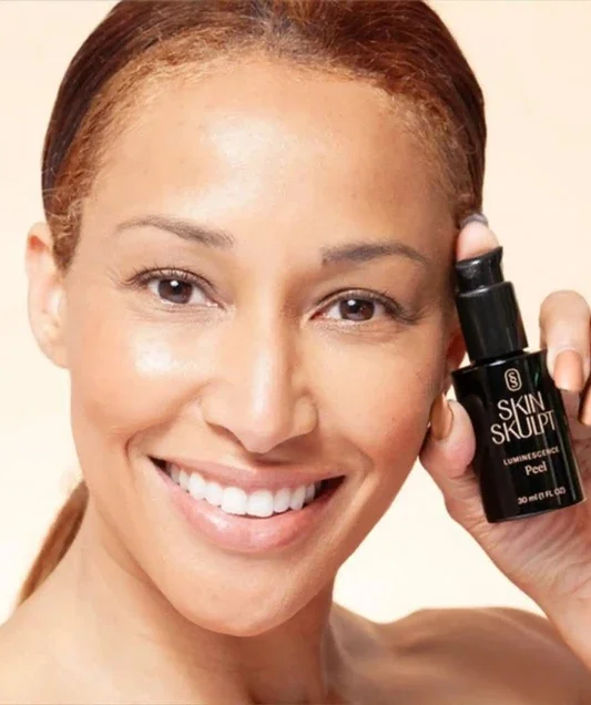
Created by acclaimed Florida skincare expert Heather Nicole, SkinSkulpt is a revolutionary skincare system designed to bring professional-grade tools and transformative results beyond the treatment room. Built on the belief that effective skincare should be accessible (read: not dependent on repeated office visits or a luxury-sized budget), the brand needed a comprehensive identity built from the ground up, along with packaging copy that could bring its wide range of proprietary products to life. Every word was crafted to make professional-grade skincare feel approachable, empowering, and easy to bring home.
Orcé Cosmetics
Website, product descriptions, blogs
Founded by Yu-Chen Shih, Orcé was created to celebrate the beauty of Asian skin and bring long-overdue inclusivity to a category where Eastern skin tones have long been overlooked. The secret ingredient? Tahitian pearls. As one of the first luxury cosmetics brands in the U.S. dedicated exclusively to this market, Orcé needed a complete verbal identity ahead of its 2019 launch—from brand naming and website copy to product descriptions and editorial content. The brand needed a sophisticated, confident, and distinctive tone to help Orcé make a memorable entrance into the beauty space. The results quickly caught the attention of major publications like Allure and Vogue, and Orcé has collected a cult following among celebrity makeup artists, famously used on stars like Michelle Yeoh, Lana Condor, Sandra Oh, and Constance Wu.
HEALTH & WELLNESS
Rula
Senior Copywriter (contracted)
Rula is an online mental healthcare platform connecting individuals with licensed therapists and helping remove the barriers that can stand between people and the care they need. As the brand evolved its campaign direction, it needed a Senior Copywriter to bring clarity and consistency to its messaging—from persona development and voice-and-tone exploration to matrix messaging across audiences and channels. The goal was to build a strategic messaging framework that could align internal teams, create a cohesive brand voice, and ensure every Rula touchpoint across the new campaign sounded like, well… Rula.
Sagely Naturals
Website, packaging, product naming, PR materials
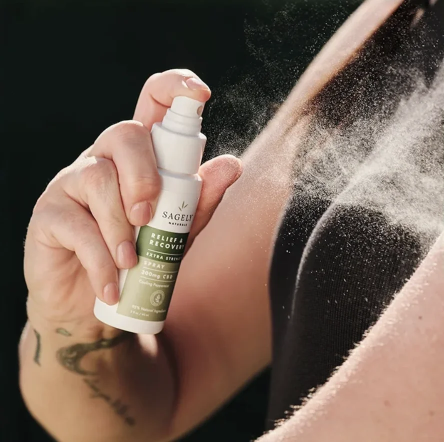
Sagely Naturals is a collection of hemp-derived, broad-spectrum CBD products designed to support whole-self wellness. From creams and sprays to roll-ons, the line delivers targeted relief with a focus on clean ingredients, quality, and botanical synergy. The brand was in need of a packaging refresh of its Relief & Recovery line, along with category-specific naming, website updates, and PR materials. The goal was to create clear, compelling copy that could communicate the benefits of each product while giving the growing brand a cohesive voice across every touchpoint.
Oh.So
Brand naming, website, product naming, product descriptions
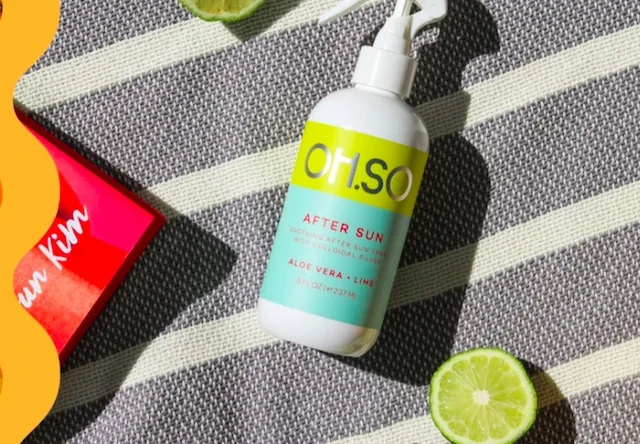
Founded around the power of colloidal silver, Oh.So set out to create all-natural, antibacterial products that felt as approachable as they were effective. With a strong product concept but little existing brand foundation, the challenge was to educate consumers without making the brand feel clinical or overly serious. The brand was in need of a fresh, fun cohesive brand experience that helped turn a potentially “scary-sounding” main ingredient (colloidal silver) into something consumers could feel great about bringing into their everyday routines.
Twig + Petal
Website, packaging, product naming, blogs
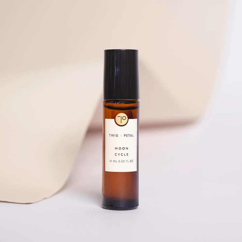
Twig+Petal is an essential oil brand rooted in purity, intention, and holistic wellbeing. To introduce itself to the world, it needed a thoughtful verbal identity and cohesive copy across every touchpoint (including categorizing and naming more than 150 products… yikes). The goal was to create a clear, compelling brand voice that could bring an expansive product line together while positioning the product as aspirational and “worth the hype.” The resulting brand and content helped Twig+Petal stand out in the crowded wellness space, earning coverage in Marie Claire, ELLE, People, and Shape.
FOCL
Product descriptions, social
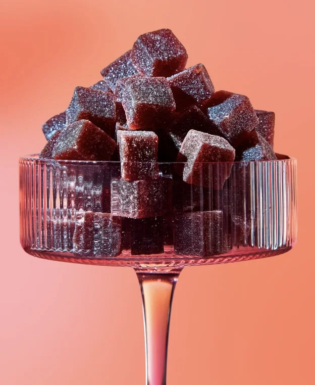
FOCL is an LA-based wellness brand creating premium hemp-derived CBD and Delta-9 THC products designed to support everything from better sleep to greater social ease (and beyond). As the brand pivoted toward a “farm-to-gummy” positioning, it needed refreshed product descriptions and social content that could help it stand out in an increasingly crowded category. The brand was in need of brand new point of view: educational without being clinical, playful without being, well, too high on itself—one that helped separate FOCL in an already-saturated marketplace.
CPG
RollinGreens
Brand identity, website, social
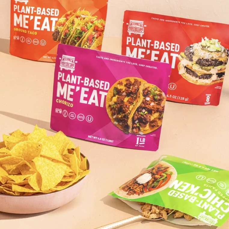
After gaining national attention on Shark Tank, RollinGreens was on a mission to grow into a standout name in the plant-based food space. More than just another meat alternative, the brand combines chef-crafted spices, satisfying texture, and shelf-stable convenience to deliver bold, flavorful meals in minutes. The brand needed a complete branding exploration, website copy, packaging, and messaging that could capture its adventurous spirit while giving consumers plenty of reasons to believe—and plenty of reasons to dig in.
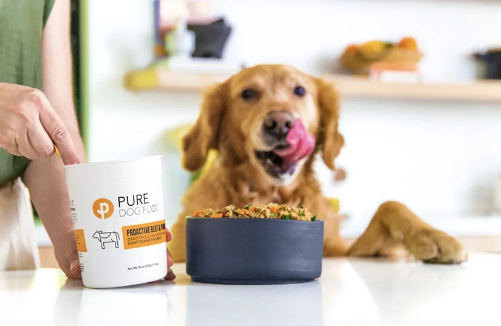
PURE Dog Food
Website, packaging
This ultra-premium, LA-based dog food brand needed a full overhaul to better connect with its discerning audience of Hollywood pet parents. PURE combines “human-grade” ingredients crafted in a chefs’ kitchen (with recipes that quite frankly, sound like a five course meal) with convenient, no-mess packaging and a veterinarian’s seal of approval. The brand needed a website built from scratch with a voice that felt clean, elevated, and naturally free of fluff. Consumer emails were crafted to reintroduce the brand while bringing more personality to transactional communications. Every word was designed to make premium pet food feel as considered as the people who choose it—and give their four-legged customers (and their doting owners) a reason to wag.
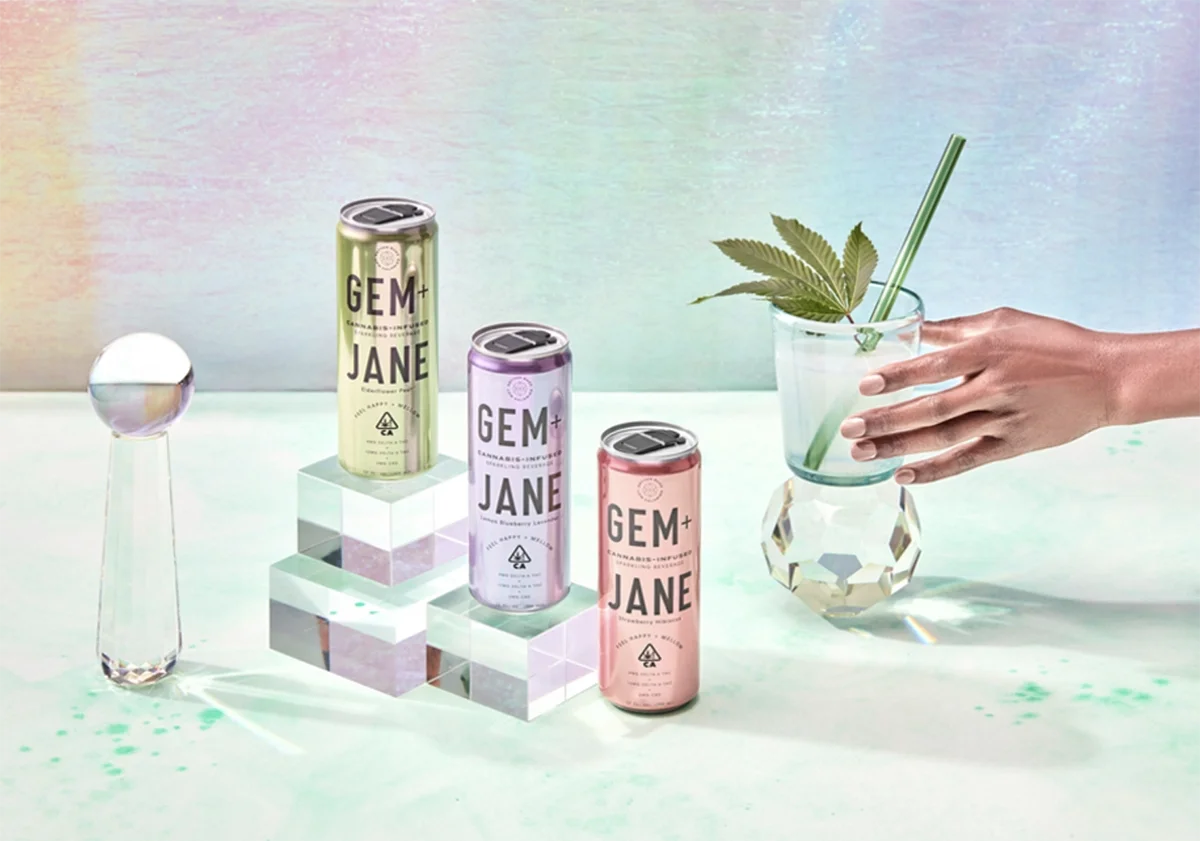
Gem + Jane
Website, packaging
Cannabis industry trailblazer CannaCraft set out to introduce Gem+Jane, a line of sparkling THC beverages created for the “canna-curious,” female-skewing consumer. For the launch, the brand needed packaging copy for five distinct flavors, with every word—from the can to the outer box—working to make the product feel approachable, elevated, and decidedly un-intimidating. Website and copy needed to reflect a strong voice that brought Gem+Jane’s brand ethos to life while giving each flavor its own distinct personality. The work went on to earn a shortlist spot in the 2021 Clio Cannabis Awards (talk about a high five).
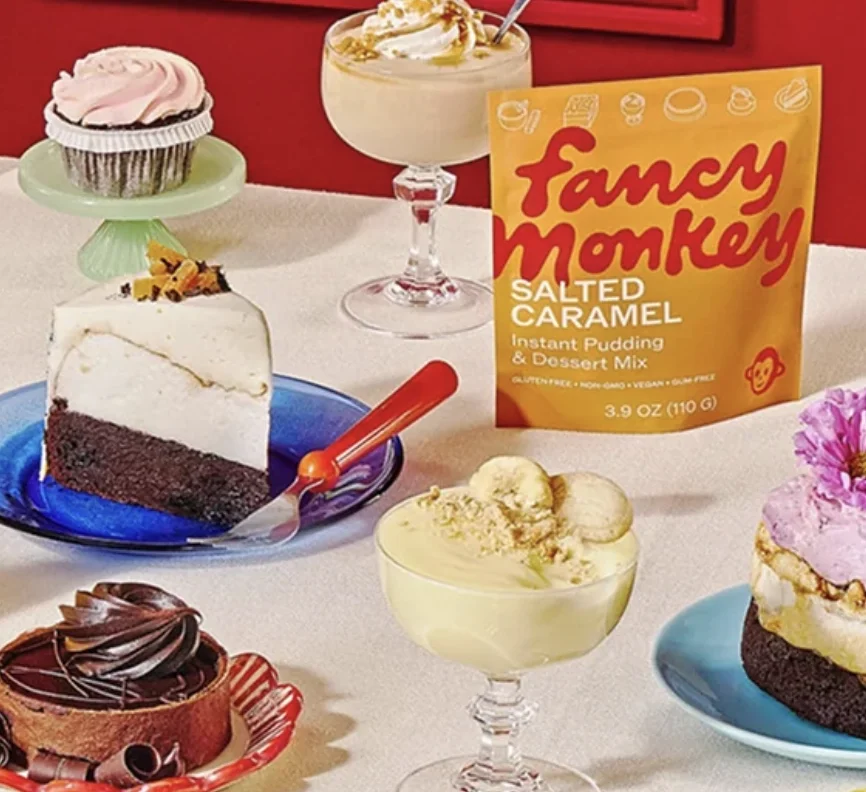
Fancy Monkey
Website, packaging, SMS, emails
Developed by an acclaimed pastry chef, Fancy Monkey is an instant pudding mix and so much more (let’s just say this isn’t your mom’s Jell-o). Made with rich, homemade flavor and ready in just minutes, it’s not only delicious pudding, it’s a cheat code to a whole world of fancy desserts. The brand needed packaging copy, website content, and SMS / email campaigns that could balance chef-crafted credibility with an approachable, irreverent personality. In other words, every touchpoint needed enough culinary cred to satisfy a pastry chef—and enough personality to make you want to lick the bowl.
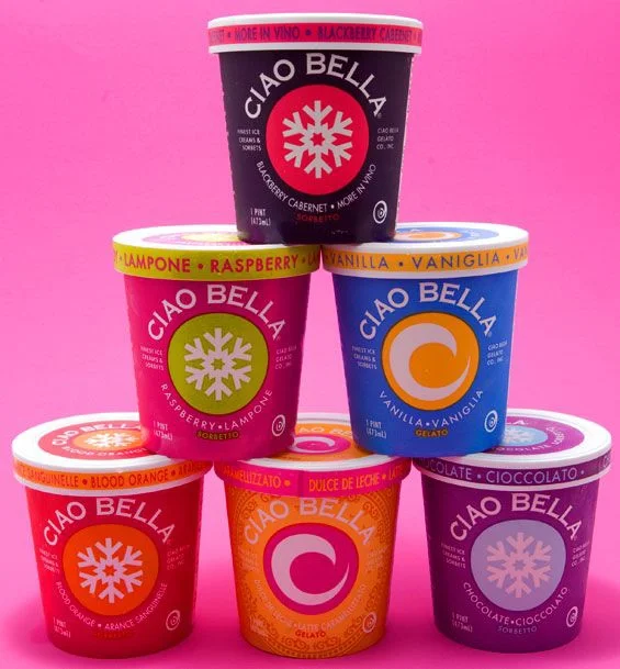
Ciao Bella
Brand identity
Ciao Bella has been pleasing taste buds for more than 40 years, but this beloved gelato brand was ready for a refresh—one that honored its scrappy NYC roots while appealing to a younger, hipper audience. Its voice and tagline needed to strike a delicate balance: rooted in Italian tradition (i.e. this stuff is the “real deal”), but it’s definitely not something you’d find in the back of Nonna’s freezer. For the brand overhaul and reintroduction, we developed a ground-up verbal identity designed to give Ciao Bella a fresh point of view and a stronger voice in the frozen aisle.
Jelly Belly
Print ads
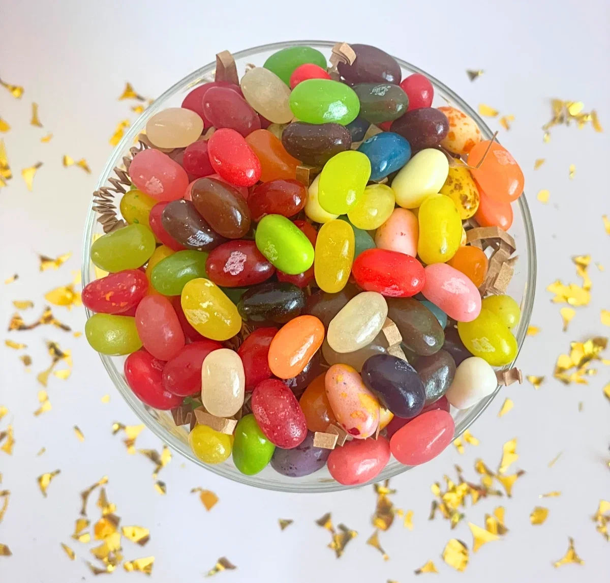
The Original Gourmet Jelly Bean® brand needed copy that could make a splash with trade customers across the U.S. and Canada. I developed a series of trade ads that showcased Jelly Belly’s one-of-a-kind, true-to-life flavors while giving buyers a fresh reason to take notice. The copy made the product’s unique selling proposition impossible to miss—and ultimately helped sweeten the bottom line.
LIFESTYLE
Surf Ranch
Corporate brochure
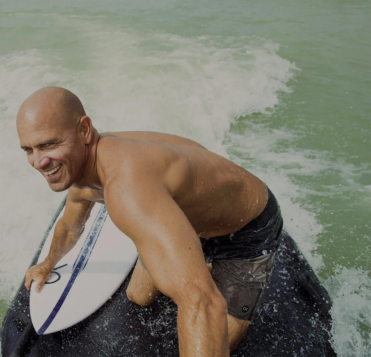
Surf Ranch is an immersive, ultra-exclusive surf destination founded by surf legend Kelly Slater. The brand needed a compelling corporate deck designed to pique the interest of Silicon Valley’s C-suite and inspire consideration for high-end retreats and experiences. The messaging leaned into the spirit of “Aloha” that comes to life the moment you enter the gates—positioning Surf Ranch as a place where business gets left at the door, connections come naturally, and uber-elite, once-in-a-lifetime experiences are the order of the day. Shaka, brah. 🤙

WIRED x Nexxus Haircare
Advertorial content
WIRED magazine faced an unexpected creative assignment: developing advertorial content for a partnership with Nexxus haircare. With two brands seemingly on opposite ends of the spectrum, the story needed a common thread—and science and innovation proved to be the perfect connection. The feature spotlighted two emerging female entrepreneurs using technology to push the beauty industry forward, brought to life through real-time interviews and some seriously creative storytelling. The result was a piece that felt at home in both worlds: smart enough for WIRED, and beautiful enough for Nexxus.
The Lost Explorer
Brand identity, packaging, emails
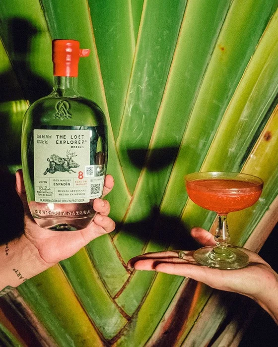
The Lost Explorer began as a Venice-based lifestyle company inspiring everyday adventurers to “live curiously.” Founded by David de Rothschild, this elevated, offbeat brand came looking for fresh eyes on its existing voice as it shifted from consumer packaged goods into the world of premium, award-winning tequila and mezcal. The mission remained the same: celebrate discovery, curiosity, and authenticity—just with a little more agave (and, occasionally, a hangover).

juli
Website, user manual
Juli is the world’s first sonic brush cleaning system designed specifically for diamond jewelry. Founder Hannah Peck needed more than a user manual—she needed a way to introduce customers to a whole and the ultimate gift for every bride-to-be. The guiding strategy was to position Juli as “every diamond’s best friend” (and it was just my job to make sure the copy sparkled accordingly).
MOMBOX
Website, packaging, insert
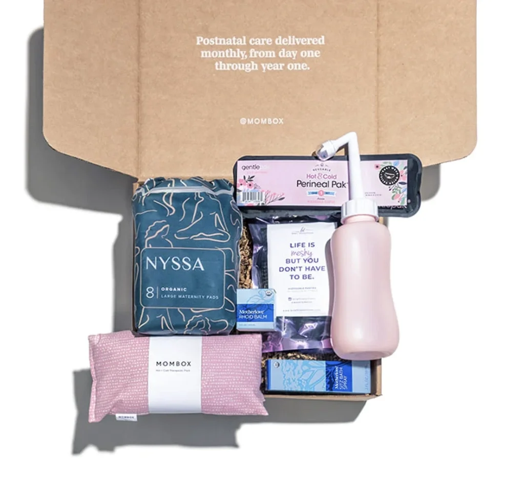
MOMBOX is a postpartum wellness brand dedicated to supporting mothers through post-birth recovery and the (often-overwhelming) transition into the world of motherhood. Through thoughtfully curated care kits, recovery essentials, and personalized gifts, MOMBOX puts mom’s well-being at the center of an experience that all too often seems to revolve around everyone else. To launch the service, the brand needed full website copy, packaging, and insert copy designed to meet moms where they are—with language that felt supportive, thoughtful, and refreshingly mom-first.
BABYATION
Website
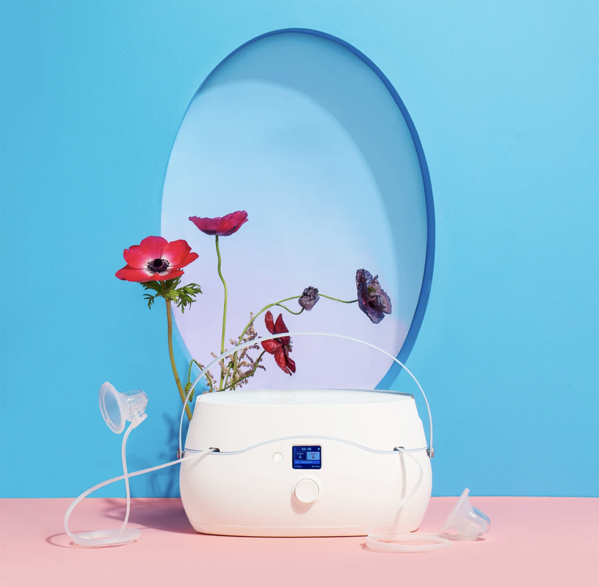
Babyation introduced The Pump, a first-of-its-kind breast pump designed for women, by women (aka it’s a breast pump that actually “gets it”). Created specifically for working moms, its ultra-discreet, app-controlled design transitions seamlessly from the bedroom to the boardroom. The founders, both successful working moms themselves, wanted their inaugural launch to do more than introduce a new product—they wanted to change the conversation around what pumping could look like while establishing Babyation as a trusted destination for working (and pumping) moms everywhere. The Pump by Babyation was named one of TIME magazine’s best inventions of 2022.
FASHION & ACCESSORIES
ThirdLove
Senior Copywriter (contracted)
Founded on the belief that “every body deserves a better fit,” ThirdLove redefined the intimates category through inclusivity, approachability, and thoughtful design. As a contracted Senior Copywriter, I worked alongside the Head of Brand Strategy to develop copy across brochures, packaging, point-of-sale, email, social, web, and blog content, as well as messaging for a full front-page feature in The New York Times. From everyday brand touchpoints to a national newsstand moment, the work helped ThirdLove make its voice as distinctive as its approach to fit.

Aline jewelry
Website, product naming, product descriptions
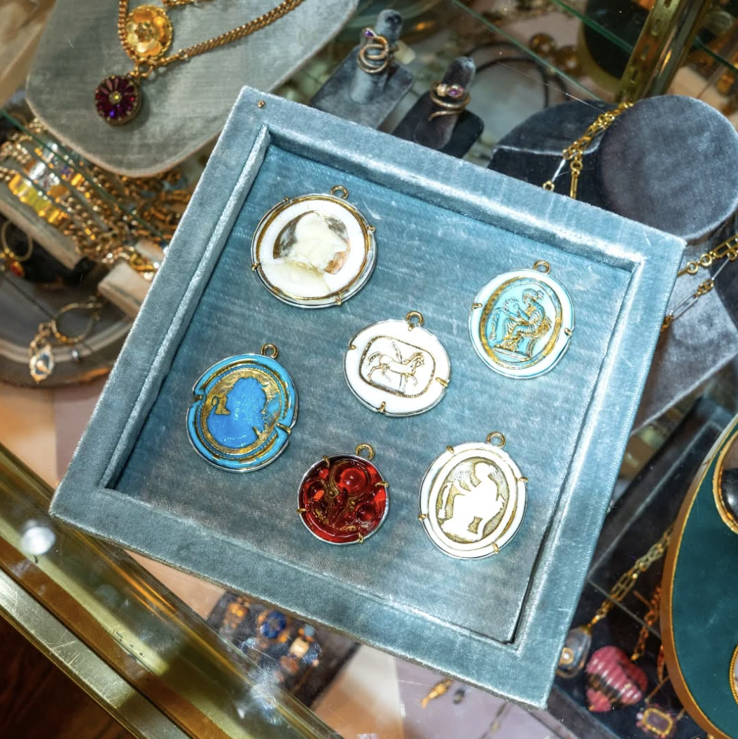
Aline Shapiro is a New York-based jewelry designer with a knack for making classic heirlooms that feel anything but expected. Her pieces are classic yet irreverent, mixing metals, enamelwork, and gemstones with the kind of attitude that feels unmistakably (and unapologetically) NYC. The copy for the website and products themselves needed to convey that same bold energy.
Lisa Todd
Website overhaul
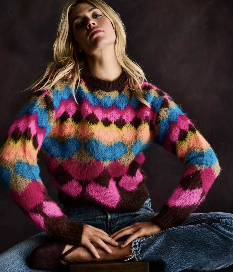
Lisa Todd is a line of “anti-basic basics”—cashmere separates with an unexpected, playful edge. The brand came for a full website overhaul and a fresh perspective on its voice, with the goal of connecting with a younger, more style-conscious audience. From product descriptions and brand storytelling to headlines and web copy, the work gave Lisa Todd a sharper, more modern voice that was every bit as unexpected as the clothes. Because “basic” is never the point when it comes to clothing (or copy).